Posts

Showing posts from 2007

Ingredients to develop a successful product - User Profiling

Users and Time spent A product is used by the buyer/customer/client and not the creator or developer. In software, Users spend more time with the software than the developers. A successful product focuses on the user experience and the value of the result provided by the software. Also note that, not all highly usable products are successful too. The value it provides to the user is the crucial factor in determining the success. The iPod case Couple of years ago, when iPod was introduced, Creative Muvo and iRiver were ruling the MP3 player arena. But iPod came like a Juggernaut and captured the market share within a year. Why? iPod addressed all features and additionally it provided a 'Value', for its case.. the 'wow' factor. Though the competition offered features, they failed to provide a 'wow' factor. iPod's touch sensitive wheel interaction was way ahead and it made people go ga-ga about that. The competition sticked to click buttons and little cumberso

OK Cancel Buttons - Evolution till Web 2.0

Image
OK Cancel Buttons - Evolution till Web 2.0 The Beginning It started with the position of the OK/Cancel buttons. When screen resolutions were 800x600, Microsoft published guidelines for UI standards. If my remembrance is right, the OK Cancel buttons are positioned to the center of the containing window. If the buttons are in a Wizard screen.. place it to the right side. Place HELP buttons to the left etc. The Evolution After 2000.. the evolution in usability trends begun gradually. Researchers found that color coding the buttons actually increase the rate of interaction or people were able to choose the right button quickly. Positive actions are coded in green or blue. Normal or less priority buttons are coded in gray or 'alert' colors such as 'red' or 'orange'. And now... Web 2.0 And now, in this web 2.0 storm, the suggested trend is : 1. Give the primary action as button (for ex. Save, OK, Apply etc are shown as buttons) 2. Give the secondary action as links (f

Interaction Design : Setup your Online / On-Demand CRM

Before a CRM can be used, it has to be configured to meet the organization's work-flow. Here are the typical steps involved in configuring an Online / On-Demand CRM. 1. Company Setup This is where you enter all the details about the organization. The name, URL, logo, address etc. Other vital information such as Currency, Tax system, Locale, Time zone should be configured here. 2. Modules Setup This is where you should manage the CRM modules. If your organization treats leads and contacts as same, then probably you can eliminate Leads and enable Contacts alone. Such operations should be done in this level. 3. Select Offerings Any organization has to sell or promote something. Broadly the offerings can be classified into Products (Physical objects) or Services (non-physical such as Web Services, Trainings etc). Some organizations may offer both. Some organizations prefer to call "Products" instead of Services. After choosing the classification, enter full or partial list of

Interface Design : Icons - Settings, Edit and Preferences

Image
Sometimes you find it difficult to decide upon which Icon to use for certain metaphors? That's the case most UI designers stumble upon. Anyway, here is a couple of tips to help you. Preferences and Settings have the same meaning. So you can use the same metaphor for both actions. Generally the Hammer+ScrewDriver or Spanner+ScrewDriver icon is used for settings. You can create crisp looking icons from 24x24 onwards. 16x16 and less will not help you to create a clean looking icon. In some cases, a pixel drawing at 16x16 size could help you. Or else, use the "Equalizer" as metaphor, which is somewhat generic and commonly found in everyday life. For "Edit" action, go for the "Pen/Pencil" metaphor. Depending upon the availability of pixel area, you can either show a paper or alphabets beneath the pen/pencil. This will enhance the metaphor. Hope this helps! :-) - Rajesh Sundaram

Orkut - New User Interface

Image
The new Orkut User Interface Refreshing! breathes a lot fresh and looks damn cool. Orkut's new user interface is way better than the previous one. I like the slick spacing and rounded-shadowed boxes. A good job from Google stable! Finally Orkut is catching up with the competition with some eye-candy interface! :-) - Rajesh Sundaram

Windows Vista - Wireless Router - Cable Broadband - Internet Access - Hathway Chennai.

I could not think of a better title.. coz it is as complex as the process of enabling a network connection in windows vista to access wireless networks. Objective To enable a DELL Inspiron laptop powered with in built Wireless Adapter to access internet via a wireless router connected to a Cable Modem. Things we had Laptop : DELL Inspiron with DELL Wireless Adapter, with Windows Vista Home. Wireless Router : DLink Airplus G, model number : DI-545 (4 port switch + wireless router). CableModem : WebStar Cable Modem (ISP : Hathway, Chennai). What you should do to access Internet? We did a lot of trial and error method to enable access. All we did end up in doing was The connection from Laptop to Wireless Router was enabled. But from Wireless Router to Internet was not enabled. So what's the solution? Well, its damn simple. You need to mirror the IP/DNS number from the cable modem, to your Wireless Router. Type 192.168.0.1 in your web browser. Type the admin user name (usually 'ad

Automobile design : Bus

Image
My Automobile Design - Bus One of my old ambition is to own a fleet of passenger buses. It was my wish to design all the body style by myself. 2 days back, I got a triggering feel... and so, here is one new-age bus design... named as "Diamondus". Competes with Dilip Chabbria's design? huh? ;-) Yeah it is! - Rajesh Sundaram

Online file explorer

Image
Just a quick design for a online file explorer. Very similar to Windows Explorer interaction, but a different web-2.0ish look and feel. The feature-set for this explorer user interface is still under discussion. Below is the first cut idea... click to view in a sepearte window. - Rajesh Sundaram

vtiger CRM - OSCON 2007 - Banners

Image
OSCON 2007 - Banners for vtiger CRM banners There were problems related to colors and DPI with the previous banners. So the job was handled by me then. I just finished the vtiger CRM - OSCON 2007 banners in CorelDraw and sent to the printer. Hopefully they should get the banners printed without the previous issues. Here are the image samples. I have asked Gopal to put these, in vtiger blog also.

AMD Mobile - Optimus 3G

Image
AMD Mobile - Optimus 3G AMD into mobile phones? naeh! Purely my own imagination. What if AMD comes up with some iPhone coolness, Vertu's quality and Nokia's ease-of-use mobile phone? Well... here is OPTIMUS 3G from AMD Mobile Devices. - Rajesh Sundaram

vtiger CRM - OSCON 2007

Image
vtiger CRM - OSCON 2007 vtiger CRM is going participate in OSCON 2007. Booth graphics are getting ready.. and unfortunately, I am not doing the graphics this time. As I am busy in other works.. someone else is doing that. But from my part.. this is what I would like to see in the graphic prints at the OSCON show :-)

Zoho Explorer

This is a nifty web based front-end which is a file browser for all your zoho services. With this tool, you can create / view / edit all documents stored in zoho services. This is now integrated into facebook too. Interestingly, after designing the UI, I felt the current design is not that fit for the purpose. A simple explorer like interface would cater the purpose. :-) - Rajesh Sundaram

Eye Candy - User Experience

Too much eye-candy in the User Interface? sometimes that may become a little overdose. Today I received a feedback saying the UI has more eye-candy effect. The problem is: all other products's UI in Z oho are plain and white'y, whereas Z oho PC has more colors. I guess this is another way of saying "change the colors.. IOW, make the product look like other Z oho products". Sukss!

Review : Stebel - Nautilus Air Horn

Image
Review : Nautilus - Pneumatic Air Horn from Stebel In India, you cannot drive without horns. I mean automobile horns. Most of the automobiles are factory fitted with normal horns, which are sufficient for just 10 or 15 feet ahead. And the sound level may not be up to the level, that fellow travellers ahead of you can hear properly. So you need to end up fitting extra horns from HELLA, BOSCH, ROOTS or STEBEL. Review : Nautilus from STEBEL Nautilus is a compact pneumatic horn. It is not a pipe-horn (as popularly called in india), but a modified -compact version of so called pipe horns. I was looking for one pair of extra horns which can scream at atleast 100 dB (to drive in Indian highways) level. I stumbled upon Nautilus from STEBEL , the esteemed italian horn manufacturers. Nautilus is little big than conventional horns and two versions are available. One is Nautilus and other is Nautilus Compact. Nautilus compact is designed to fit within compact spaces, ideally suitable for bikes and

Hoplite

Me started working on "Hoplite". - Rajesh Sundaram

ABT Maruti charging for Pick-up and Drop

Today I called ABT chennai (Guindy) to pickup my Alto which is due for First Free Service. The un-friendly customer service said, they charge Rs.175 for pick-up and drop. I remember none of the other Maruti dealers charge a paise for pick-up and drop. But ABT Maruti, Chennai said they dont offer free service anymore and they charge Rs.175 from last month onwards. Is this a way to sustain new/loyal customers? Or, ABT desperately wants to avoid customers and lose business? - Rajesh Sundaram

Contact & Task Management - Online

The Contact management is already a crowded market. Having renowned players like 37signals for web-apps and Goldmine for desktop-apps. So what would you expect from a contact management software/application? If I am the user, I will expect the following modules as the bare minimum. 1. Managing Contacts (Create/Edit/Delete/Import/Export/Plugins) Because I use multitude of web applications my contacts are partly in my yahoo mail address book, gmail address book, my Thunderbird Address book and my mobile phone. In the best case, I would prefer an app which can import contacts from all these services (via online or inbuilt plugins). Better worse (oxymoron??) , if I can import contacts from CSV files generated from above services/apps. Worse, Create/Edit option to manually enter my contacts' details. 2. Assign Tasks to Contacts (Calendar) A Caledar module with the abilities to create/assign/edit tasks related to contacts. If it has natural language processing like Google calendar, I wou

Positioning DIV to the Center of Browser Viewport

Image
Positioning DIV to the center of Browser Viewport Sometimes I write some JS code to prepare my HTML mockups. In this post I am describing the step-by-step approach on how to position a DIV to the center of browser's viewport. Case Assume that you have a DIV and you want to show it upon clicking a link or button. And that DIV must appear exactly on the center of the browser's window. Technically browser's display area is called "View Port". So our aim is to display a DIV to the center (origin) of the view port. How to do this? 1. Create the DIV. 2. Specify CSS properties 3. Write a few lines of Javascript code to position the DIV 4. Insert an action "onClick" to a button or link in the HTML. Step 1 Write the HTML code for the UI and enclose the code chunk with a DIV. Specify some valid ID for the DIV. For example "AddUserDialog". Step 2 A DIV element, by default will be displayed inline. A dialog box or some other "windowed" UI require

Rediffmail - Usability Issue

Image
My sister is still using rediffmail's old UI. Reason? she got used to that. And she is not comfortable with the other UI that copies Yahoo Mail. I found a usability issue in the old UI. Rediffmail displays the "From" address as link and Subject as non-link (plain text). That was a silly usability issue. Why not the subject be given as a link. Usually people read the "From" column and read the corresponding "Subject" column. If the "Subject" is of importance to them, they naturally move the mouse and click the subject. To be safe, I would say majority of people tend to click the subject and not the From address. Rediffmail makes the user to click the FROM column, and in situation where the user uses a ultra wide screen, it is damn tedious. Rediff guys, if you read this blog, please enable the subject line as links. - Rajesh Sundaram

Seth Godin's "Two reasons..."

I agree with Seth 200.. 20000% .. His words are damn true ! hahahh.. :-D http://sethgodin.typepad.com/seths_blog/2007/03/the_two_reasons.html ============== The two reasons people say no to your idea "It's been done before" "It's never been done before" Even though neither one is truthful, accurate or useful, you need to be prepared for both. ================ Sometimes.. this is where an idea or innovation gets murdered, espicially if those words are from your manager or leader ! :-) - Rajesh Sundaram

Pure-it.com and its web site!

Image
Sometimes Usability organizations are little careless about their websites. One such company is Pure-IT which has operations all over the world. Their website is little careless about the wide-screen resolution aspect. Check out how the site looks in a 1920x1200 res monitor. The content appears in the middle, and the navigation sticks to the extreme right. So much for a Usability Consulting company! - Rajesh Sundaram

Improving RankQuest.com - HTML Validator Tool's UI

Image
Improving RankQuest.com - HTML Validator tool UI Following my previous post about Improving User Experience in 2 hours, here is another UI which I designed for Rankquest.com’s HTML Validator tool. RankQuest is a great site for SEO Techies. They offer good articles, and some cool tools that are really useful for website managers and developers. HTML Validator HTML Validator is one such simple tool, which uses HTML Tidy in the back-end. Their front-end UI is pretty basic and the results closely follow the Tidy’s result pattern, which is difficult to read and grasp the overall result. My UI suggests a simple dashboard which says whether the URL given is OK or BAD using a single icon metaphor. And within a single line it lists the number of errors and warnings. Below the dashboard, there comes the RankQuest HTML Scanner. This is my idea of showing “where the error is” instead of a lenghty “Line 1 Coloumn 32: erroor”. This precisely gives the visual location of where the error is. A u

Analysis Paralysis and UI Design

What is Analysis paralysis? Analysis paralysis is defined as " Analysis paralysis is an informal phrase applied to when the opportunity cost of decision analysis exceeds the benefits." in Wikipedia. In software development Analysis paralysis can occur in any phase like project planning or developments or decision-taking. Analysis paralysis & UI Design A UI designer may get into this situation when designing UI or Interactions. I have been into such situations where too many tree of possible answers and combinations of navigation patterns occured and I ended up finalizing nothing. :-D I guess, any UI designer working on some new or enhancing works has higher possibility to get into such situations. My style of fixing it.. When I get into this situation.. I stop working on that module or UI instantly. Take some rest or divert my focus to something else. And after some time, I start from the beginning.. following my intuition (half of the time it works.. lol) or follow so

Google vs Yahoo usability

I am using Gmail and Yahoo mail. Though I like Gmail's instant reply usability, I hate to find no-folders. Everytime I have to create a label, assign it to some mails and find it annoying to see the mail still listing there. Does Google wants the users to adapt their 'style'? Here is an interesting article in GUUUI.com that discusses something about Google and Yahoo usability . Read the interesting story in the comment section too ! :-) - Rajesh Sundaram

Embedding Scriptaculous - My first try

Scriptaculous doesn't need any introduction. Most of you may know what it can do, and how popular it is. For those who need an intro, "Scriptaculous is a set of open-source, free javascript library which allows you to enhance your web experience in terms of accessibility, UI controls, special effects and AJAX support". You can read the complete history and documentation here. Now.. being a User Interface Designer, Interaction Designer (too many roles??) I have coded only the basic HTML and CSS stuffs.. and today I thought of trying to implement a scriptaculous code into my HTML proto design. So I started digging the scriptaculous.. and learned how to integrate it. Step 1: Download the latest Scriptaculous library from http://script.aculo.us in .zip format. Unzip the contents into the folder where you store you HTML file or any folder of your choice. Step 2: Create a new HTML page, and link the "prototype.js" and "scriptaculous.js" files in the HEAD p

Improving User Experience - Part 2

Image
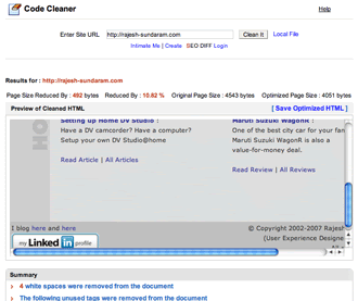
Improving User Experience in 2 hours - Part II In Part 1, the User Interface of Code Cleaner was analysed . It is found that the UI has poor layout design and the information were not delivered in a way such that it makes some clear sense. Now, let us list out the information we have in hand. Size of the page in bytes Optimized size of the page (code cleaned) in bytes % of file size saved/reduced # of bytes saved / reduced Link to download the optimized/cleaned code. Preview of the cleaned webpage Summar of the clean up So we have 7 information in hand. Let us try to design a better UI with this information. Approach. To start, think of what a user might expect from such a code-cleaning software. As a user, possibly If I use such a software, I will expect to see the analysis of the current page in terms of file size, how much does it takes to download. Next, I would look for the optimized file size and the split up of how much bytes removed, (in % too) and how much download secs can be

Improving User Experience in 2 hours- Part 1

Image
Improving User Experience in 2 hours - Part 1 This is my attempt to improve a web application's user experience in just under 2 hours. :-) So you are given a task to improve the user experience of a web application. So how will you do it? Let us start with picking up a web application. For this task, let us pick up the website, RankQuest.com . They offer a dozen online SEO tools and some nice SEO articles. They do blog and manage to gain some good amount of traffic too. One of their tool, the Code cleaner is our target now. We will take the question-answer model to discuss our task. What does Code Cleaner do? Code Cleaner takes up a webpage, examines the HTML code (note: only the HTML code) and removes the unwanted tags, comments etc. The result of such an action is reduced file size. How does Code Cleaner interacts with user? The Code Cleaner requires the URL or the path to a local file. Once the URL/path is given it retrieves the contents, analyzes them and strip out unwanted ta

Madras Eye?

Donno for the past one week.. my eyes are slightly reddish! And throat infection, cold and dry cough. Dammit! Madras eye? - Rajesh Sundaram

Zoho Widget - Office XploRR

Image
Zoho Widget - Office XploRR Office XploRR is my idea of a Widget for Zoho. The prime idea is to offer an explorer kind of tool, which will list all documents saved under the Zoho Writer , Zoho Sheet and Zoho Show online services. The user has to provide his/her login details and the widget will fetch and show the list of documents stored in the server. The widget will launch a browser window/tab opening the relevant document, when click occurs. Also each document can be assigned sharing privileges, download options (PDF, HTML, Native format) and even delete. The Office XploRR widget also enables to compose a new document straight away. The sample screen mock-ups I did for Office XploRR widget are shown below. 1. Login Screen 2. Office XploRR - File Browser listing all files and categories 3. Drop down menu - Rajesh Sundaram

Kicking back!

Almost an year and half of hibernation. Yep.. once upon a time I was posting the blogs under the name Coppertank. But soon I had to scrap it and hibernate due to lack of time and other official things. Now I am woke up and back to life. 3 2 1 START ! - Rajesh Sundaram